“Never solve a problem from its original perspective.” - Charles Thompson
That’s what I have been sharing with people around me. There are innumerable ways to look at the same situation. What seems as a humongous task may seem easy after you look at it from a different angle. Somehow, a problem may seem as a challenge only if you change your perspective!
The same thought process can be applied even in terms of design. An interesting thing about anything related to design is that one can have as many views as required for the same topic. Another unique point is that every individual has a different method of approach. This reveals many interesting options. Which is why, I come back to one point I have been pondering about, why can’t this be applied to web design as well?
Take for example site maps on websites. I have often observed how these are repetitive in terms of design. I agree ease of use is important, but surely there can be a better way of presentation! It should make a user want to browse the site.
On this note, I thought about creating something on my own to explain it better. Here’s my creation below. A little bit of Photoshop with website interactivity…that’s the key to visually enriching site maps!
(This interactivity is created with Raptivity Web Expert’s Site Booster Pack.)
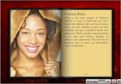
In this example, I have attempted to design using food as a subject for the sample. What I have tried here is to bring attention to the important sections of the website. Many more sections can be added depending upon the design. This will not only make the section visually-appealing, it will also serve in making users browse the website.
I hope this example has given plenty of new ideas for your web design. Once your inspirations are ready, do share it with me too! It would help other readers as well as me, to find out about the many approaches towards web design.
Subscribe to:
Post Comments (Atom)


No comments:
Post a Comment