“Never solve a problem from its original perspective.” - Charles Thompson
That’s what I have been sharing with people around me. There are innumerable ways to look at the same situation. What seems as a humongous task may seem easy after you look at it from a different angle. Somehow, a problem may seem as a challenge only if you change your perspective!
The same thought process can be applied even in terms of design. An interesting thing about anything related to design is that one can have as many views as required for the same topic. Another unique point is that every individual has a different method of approach. This reveals many interesting options. Which is why, I come back to one point I have been pondering about, why can’t this be applied to web design as well?
Take for example site maps on websites. I have often observed how these are repetitive in terms of design. I agree ease of use is important, but surely there can be a better way of presentation! It should make a user want to browse the site.
On this note, I thought about creating something on my own to explain it better. Here’s my creation below. A little bit of Photoshop with website interactivity…that’s the key to visually enriching site maps!
(This interactivity is created with Raptivity Web Expert’s Site Booster Pack.)
In this example, I have attempted to design using food as a subject for the sample. What I have tried here is to bring attention to the important sections of the website. Many more sections can be added depending upon the design. This will not only make the section visually-appealing, it will also serve in making users browse the website.
I hope this example has given plenty of new ideas for your web design. Once your inspirations are ready, do share it with me too! It would help other readers as well as me, to find out about the many approaches towards web design.
Monday, April 12, 2010
Monday, April 5, 2010
Adding Spice to Websites!
There’s a lot that goes behind designing a website. It requires more than just designing and programming skills! In fact, the creation of a website should be done with ample amount of consideration and care, which involves thinking from the users’ point of view. One needs to bring together different ingredients for a creatively designed website that communicates the message effectively! In fact, the process is the same one goes through while whipping up a very sumptuous dish! What goes behind such a dish is the careful use of ingredients measured in the right proportion. Only then, can one enjoy a well-cooked meal!
Some of the main things required to be presented in a website are the company/service information; products and offers, contact information, etc. This is required to connect with users globally.
Through the Internet, users have easy access to information. They can access information such as their favorite brands, company, product, service, personality and lots more! The website then is the main medium of communication between a company and the user.
A creative web site requires a good balance between design and content. When words are supported with an attractive display of visuals, it engages the users of the website. Many successful websites are able to get visitors involved in one way or another. By making the website more engaging to visitors, you are more likely to get a high number of repeated visitors.
Even before a user reads the content of the website, it is the design and layout of the website which attracts the user. As the famous saying goes, “First impressions are the last impressions”, this holds true even in terms of websites. A content-rich website can drive away a user if it is not displayed properly.
Hence, a web site needs to first look attractive and engage users so that the whole experience of surfing through the site turns out to be an interesting one. Attractive panels, banners, color schemes, buttons, graphics etc., are some of the ways used to turn a website into a visually attractive place! Although a lot of effort is channelized in this direction, many web sites do not meet the expectations of the end users. Even if they attract users, it hardly generates interest to hold a users’ attention span for a long duration. This is when we come to the vital question, how do we add that right element of spice to a website?
Whip Up the Right Recipe!
Recipe No. 1: Interactivity is the Main Ingredient
Interactivity is about keeping the user on the page. Earlier, website designers used Flash to make a website appear attractive and interactive. However, adding Flash interactivity to a website would take days to program and customize, as per the website requirement. On the other hand, rapid interactivity, a new paradigm, allows web designers to add exciting interactivities to websites within a matter of minutes through simple customization.
Why interactivity? Interesting and interactive pages encourages users to stay on the page for a longer duration. This also gives the website owner enough time to convey a message across effectively.
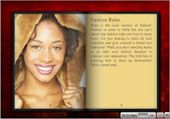
In the above image, important action items have been grouped together. This interactive feature holds user attention in one area and makes a user perform an action. An attractive and interactive display ensures users spend time on the website exploring it further.

As seen in the above image, a site map which usually does not form as an attention-grabbing element has been used to capture attention. The site map highlights important sections of the website which makes it easier for a user to navigate. The visually pleasing elements stand testimony that site maps need not always be designed in a plain manner.

A product/service website usually declares special offers. For example, a special discount for only first hundred users on its website. These kind of special offers can be effectively shown using a peel banner as shown in the above image, which generates curiosity amongst users to explore what’s underneath the hood.
Creating such interactions does not require one to spend hours on programming using rapid interactivity! For many other interactivity ideas read the following blog post.
Using such rapid interaction creation technology, one can easily customize Flash interactivities through a template library. It not only brings about a fresh change in the way content is presented, it saves web designers those grueling hours spent on programming!
Recipe No. 2: Social Interaction is the Dessert!
A website with a fantastic design and layout can be useful only when it connects with its users effectively. The more people that connect and interact on the website, the better it is for you! Take for example, a product website. The moment such a website includes elements for social interaction; it will create a more loyal base of users. The inclusion of activities such as FAQs, Debates, Polls, Presentation Sharing, etc, will ensure users interact with each other. Besides, users of a particular product may even recommend the product to others. A user may even come up with valuable suggestions to be included in the product. The suggestions from users are very important as they are the users of your product or service. They can be the best one to suggest improvements or new features in your offerings. After all, co-creation is what every company would aim for from its users.
Isn’t it time you switch and try out these ingredients to spice up your websites? I am sure you will have a successful website with all these elements!
Some of the main things required to be presented in a website are the company/service information; products and offers, contact information, etc. This is required to connect with users globally.
Through the Internet, users have easy access to information. They can access information such as their favorite brands, company, product, service, personality and lots more! The website then is the main medium of communication between a company and the user.
A creative web site requires a good balance between design and content. When words are supported with an attractive display of visuals, it engages the users of the website. Many successful websites are able to get visitors involved in one way or another. By making the website more engaging to visitors, you are more likely to get a high number of repeated visitors.
Even before a user reads the content of the website, it is the design and layout of the website which attracts the user. As the famous saying goes, “First impressions are the last impressions”, this holds true even in terms of websites. A content-rich website can drive away a user if it is not displayed properly.
Hence, a web site needs to first look attractive and engage users so that the whole experience of surfing through the site turns out to be an interesting one. Attractive panels, banners, color schemes, buttons, graphics etc., are some of the ways used to turn a website into a visually attractive place! Although a lot of effort is channelized in this direction, many web sites do not meet the expectations of the end users. Even if they attract users, it hardly generates interest to hold a users’ attention span for a long duration. This is when we come to the vital question, how do we add that right element of spice to a website?
Whip Up the Right Recipe!
Recipe No. 1: Interactivity is the Main Ingredient
Interactivity is about keeping the user on the page. Earlier, website designers used Flash to make a website appear attractive and interactive. However, adding Flash interactivity to a website would take days to program and customize, as per the website requirement. On the other hand, rapid interactivity, a new paradigm, allows web designers to add exciting interactivities to websites within a matter of minutes through simple customization.
Why interactivity? Interesting and interactive pages encourages users to stay on the page for a longer duration. This also gives the website owner enough time to convey a message across effectively.

In the above image, important action items have been grouped together. This interactive feature holds user attention in one area and makes a user perform an action. An attractive and interactive display ensures users spend time on the website exploring it further.
As seen in the above image, a site map which usually does not form as an attention-grabbing element has been used to capture attention. The site map highlights important sections of the website which makes it easier for a user to navigate. The visually pleasing elements stand testimony that site maps need not always be designed in a plain manner.
A product/service website usually declares special offers. For example, a special discount for only first hundred users on its website. These kind of special offers can be effectively shown using a peel banner as shown in the above image, which generates curiosity amongst users to explore what’s underneath the hood.
Creating such interactions does not require one to spend hours on programming using rapid interactivity! For many other interactivity ideas read the following blog post.
Using such rapid interaction creation technology, one can easily customize Flash interactivities through a template library. It not only brings about a fresh change in the way content is presented, it saves web designers those grueling hours spent on programming!
Recipe No. 2: Social Interaction is the Dessert!
A website with a fantastic design and layout can be useful only when it connects with its users effectively. The more people that connect and interact on the website, the better it is for you! Take for example, a product website. The moment such a website includes elements for social interaction; it will create a more loyal base of users. The inclusion of activities such as FAQs, Debates, Polls, Presentation Sharing, etc, will ensure users interact with each other. Besides, users of a particular product may even recommend the product to others. A user may even come up with valuable suggestions to be included in the product. The suggestions from users are very important as they are the users of your product or service. They can be the best one to suggest improvements or new features in your offerings. After all, co-creation is what every company would aim for from its users.
Isn’t it time you switch and try out these ingredients to spice up your websites? I am sure you will have a successful website with all these elements!
Tuesday, February 9, 2010
Beyond Attracting Users to Websites!
All creative geniuses always love to bask in the glory of being poles apart from the rest. However, in terms of web design, as you all agree, one needs to be creative knowing that the design has to communicate and convey the message effectively.
This is exactly the reason I have always felt the need to use website interactivity for web design. I am sure by now, just like thousands of web designers and developers worldwide, you have followed the benefits of website interactivity. This time round, I have yet another way of designing websites with interesting creative elements.
As a web designer, apart from attracting users to websites, it is also required to make the user perform an action on the page. Only then, can the message be communicated to the web visitor effectively. Let us take an example of a Page Peel Banner (see below). What I have here is an interactivity that is used effectively to present the company/brand. I thought of creating this sample so that you can know exactly why a Page Peel Banner can be an effective medium to present a message to users on the Internet.
That’s what I call website interactivity with a difference! I feel, I had a great time designing without really spending a lot of time on Flash. Right now, I am looking forward to reading about your experiences in website design! Please do feel free to share your thoughts as well!
Tuesday, January 12, 2010
The Next Level of Web Design

Web design is a topic that invites many ideas, from experts who know about designing and from those who may not even have a clue about design! There are different ways of looking at one subject and present it accordingly. A website about any topic can be presented in many ways. The best design though is one that has used all the elements in a proper way.
This is when I would like to introduce you to the next level of web design. It’s all about boosting your website to a new level. To understand this further, I can take up an example. This can give a clear picture about the new level I am about to put forth.
5 Ideas to Boost Your Website
Pay attention to details
To present your content and design in an effective way, you need to pay attention to the details. Take a shopping website for example. A shopping website that sells products can be more effective in reaching the target audience when it includes testimonials. If presented in a plain way, these will not gather attention. These testimonials if presented in a creative and interactive way will attract the attention of users and also increase the authenticity of the website and its products.
Enhance the finer points
After bringing attention to details, you also need to enhance the finer points. Here, we can take an example of a site map of any shopping website. There are many sites which do not pay attention to the design of site maps. In the case of a shopping website, the site map can be designed very creatively to make a user explore more!
Make users perform an action
A shopping website also needs action on part of the users. There is a need to capture the attention of the users and also make them perform an action. For this, one needs to consider the main action items. These should be in relation to each other. For example, the shopping website may have special designer collections. The tabs for these can be placed next to each other instead of a regular style of presentation. A users’ attention will be focused on one area when related action items are next to each other. A user will be able to view and refer to the related topics with great ease.
Present messages as teasers
It is not enough to only capture attention of the user. There is also the need of engagement on a website. This is why the way a message is presented is very important. For example, a simple banner that displays a message may not even increase interest amongst users. A shopping website will need to create action. A shopping offer can be presented in parts on a banner. The first message should catch the attention and the rest should follow accordingly. For example, a banner that can be peeled to reveal more information can be more effective to convey the message.
Highlight the urgency factor
This applies particularly to offers or contests that are a common feature on any site. In this case, since we are referring to a shopping website, we can take an example of a discount offer. Usually, an offer may be highlighted in one area of the website. Here, with website interactivity, the same offer can be highlighted with a timer that gives details of the offer in an attractive manner. A user will thus be able to see and view offer details easily which in turn proves to be beneficial for the website!
This new level of website interactivity is aimed to boost your site amongst users. I am sure you will find these ideas very useful for your web design.
View these ideas with these brand new Site Booster Samples
Tuesday, December 29, 2009
This New Year, usher in New Design Elements!

The celebrations are on! The decorations are out and so have the New Year resolutions begun! I have seen many trying to stick to their New Year’s resolutions all through the year. The argument often continues about this tradition considering that promises are meant to be broken!
I have always been passionate about design. And my resolution has always been to whip up something exciting and creative every year! This year, I did come up with few concepts. That is why I feel website design in 2010 should be and will be a step ahead…it will be all about keeping the user engaged on the page with website interactivity with a purpose!
Website Interactivity: 2010 trends
I have seen many websites that do use different forms of interactivity to engage users. The purpose of the interactivity is fulfilled only when it does manage to engage users on the page.
The Predictions for Website Interactivity: 2010
I do have a few ideas for website interactivity for designers who want to engage users on the site. I surely do wish to share the same thoughts and know your feedback.
Include interactions that engage users in a creative manner. For example, a product website can look more authentic if it has testimonials displayed. This is not a new concept, but here I am referring to a better and enhanced display of the same. The original method is placing the text with the quote marks on the side panels. One can display the same in an interactive way, wherein the testimonials are provided and given a personal touch, using your customer’s video or image and supported with attractive visuals. This makes a user feel like clicking to view more. A customer may also feel that he should be there in the list of the testimonials!
Present a set of the not-so-obvious elements in a different light. This means, bringing about creativity in areas least expected. For example, jog your memory and try to visualize different site maps. I am sure; this brings to mind some boring layouts and a typical display of topics of the site. It surely does nothing to induce an action or make a visitor want to explore it further. I suggest that one can present this area in a creative manner as well. Use the topic of your website to your benefit and create interactions around it. There are a few websites that employ this technique (read this post for more information); it makes a user want to explore the site as it is presented in a combination of visuals and animations. That sure brings about a unique look for websites.
The key to website interactivity for the New Year is to think Out of the Box. Keep your user in mind and design around it. It is bound to give many new approaches towards website design. I hope to see many more creative designs in the New Year, enjoy the celebrations for the New Year!
Happy New Year to all of you!
Subscribe to:
Comments (Atom)